Wooden furniture is one of the biggest influences on the character of a living space. Light oak furniture gives an airy, natural look, while dark walnut tones can create a warmer, stronger and more sophisticated atmosphere.
Getting the colour scheme right takes more than choosing the wood tone you like. Wall colours, flooring, fabrics and lighting all directly affect how the wood will look.
So which colours should you use with different wood tones? And how do you balance more than one wood colour in the same room?
Understanding the undertone of wood
When assessing wood colours, it is not enough to look only at whether they are light or dark. Every wood has its own undertone.
- Yellow undertones: Common in oak, pine and birch. They give a warm, bright look.
- Orange undertones: Most noticeable in some pine surfaces. They can be balanced with earth colours and blues.
- Red undertones: Found in woods such as cherry and mahogany. They create a warmer, more classic effect.
- Grey undertones: Stand out in smoked oak and wood surfaces with grey pigment. They suit modern designs.
- Brown undertones: Noticeable in dark woods such as walnut. They pair well with cream, beige and green.
Looking at a wood sample next to a white surface makes its undertone easier to spot.
Colours that go with light oak and other light woods
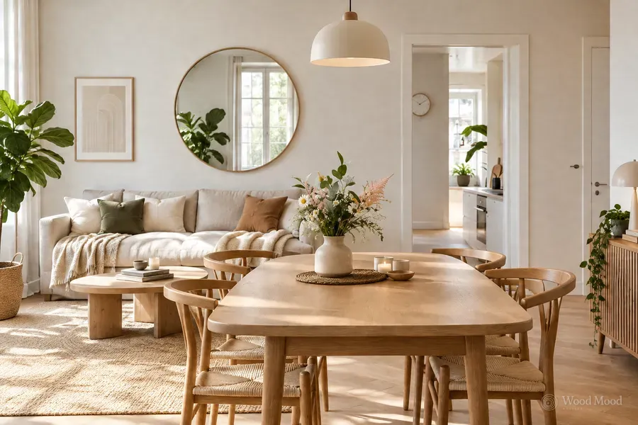
Woods such as light oak, ash and birch are popular in modern, Scandinavian and Japandi interiors.
Combined with natural light, light-coloured woods help a room look airier.
Colour suggestions for light woods:
- Off-white and sand beige: A simple, warm and lasting look
- Sage green: A natural, restful atmosphere
- Light grey and grey-blue: A modern, balanced contrast
- Terracotta and light clay tones: A warmer decor with more character
A light oak TV unit, for example, can make a balanced seating area with off-white walls and sage green armchairs.
In rooms designed entirely in light colours, using different textures such as linen, wool and natural stone stops the space looking flat.
Natural oak, pine and teak tones
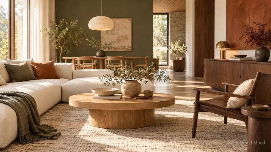
Mid-tone woods are easy to use alongside both light and dark colours.
The honey-like warmth of natural oak, the yellow tones of pine and the brown texture of teak can all be adapted to different decorating styles.
Colours that go with mid-tone woods:
- Olive and forest green: A natural, warm and strong look
- Petrol blue: A striking contrast with the warmth of the wood
- Stone grey: A modern, simple atmosphere
- Cream and earth tones: A soft, balanced transition of colour
Natural oak kitchen units, for example, can be completed with a warm grey worktop and cream walls.
If you want a bolder design, you could combine dark green doors with natural oak details.
What matters here is that the wood and the wall colour are not too close to each other. A clear but balanced contrast, rather than a slight difference in tone, shows the furniture off better.
Colours that go with walnut and other dark woods
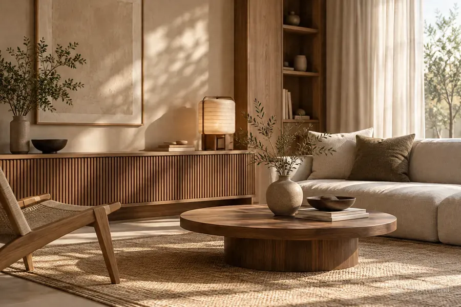
Dark woods such as walnut and smoked oak give living spaces a strong character.
Often chosen in designs that mix modern and classic lines, these tones look elegant when paired with the right colours.
Colour suggestions for dark woods:
- Cream and warm beige: Balances the dark colour of walnut and brings lightness to the room.
- Emerald and bottle green: Creates a deep, sophisticated atmosphere.
- Stone and light grey: Sets dark wood off in a modern way.
- Off-white: Gives a strong but simple contrast.
- Bronze and brass details: Complete the warm character of the wood.
A dark walnut TV unit can make a balanced living room with cream walls and light beige sofas.
Smoked oak cabinets, on the other hand, take on a modern look with light grey surfaces and black metal details.
In small rooms or rooms with little light, it helps the space look airier to use dark wood on selected pieces of furniture rather than on every surface.
Can you mix different wood tones?
The floor, doors, cabinets and tables in a room do not all have to be the same wood colour.
When the tones are balanced properly, they add depth and character to a space.
The main points to keep in mind are:
- Choose a dominant wood tone. Use the main tone on the large pieces of furniture and treat the other woods as accents.
- Watch the undertones. Woods with a similar warmth usually go together more easily.
- Create a clear contrast. Different tones, such as light oak and dark walnut, can look more balanced than colours that are very close but do not match.
- Repeat colours. You can complete a dark walnut coffee table with a small shelf or decorative detail in the same tone.
- Use transitional surfaces. A rug between a wood floor and the furniture makes a soft transition between different tones.
The aim is not to turn all the wood into one colour, but to create a deliberate relationship between the tones.
How lighting affects the colour of wood
The colour of wood can look different depending on the light in the room.
Wood that looks warm and lively in a sunny room can look dark or grey in a room with less light.
In north-facing rooms especially, you could choose woods with warm undertones and light wall colours.
In south-facing rooms with plenty of light, strong colours such as dark walnut are easier to use.
Artificial lighting has a similar effect. Warm white light brings out the yellow and brown tones of wood, while cool white light can make some woods look greyer.
That is why it is important to judge wood and paint samples not only in a catalogue, but also in the daylight and the evening lighting of the room where they will be used.
How to build a colour palette that works with wood
A few basic steps can make choosing colours easier.
1. Assess the existing surfaces. Note the colours of the floor, the doors and any large furniture that will stay.
2. Choose the main wood tone. Consider the colour of the new furniture together with the existing surfaces.
3. Decide on the wall colour. Choose a colour that either sets off the wood or blends with it.
4. Complete the look with textiles and accessories. Use the colours of curtains, rugs and sofas to make a transition between the wood and the walls.
5. Check with real samples. Look at the colours at different times of day and under the lighting you will use.
The 60-30-10 colour split often used in decorating can be a useful starting point: about 60% main colour, 30% secondary colour and 10% accent colour.
These proportions are not a fixed rule; the aim is for the colours to look balanced together.
Common mistakes when choosing colours
Some choices can make it harder to get the result you expect when matching wood and colour.
- Choosing the wood colour from a screen or catalogue photo alone
- Using too many different wood tones together
- Choosing the wall colour without considering the undertone of the wood
- Ignoring the relationship between the furniture and flooring colours
- Using dark colours too heavily in small rooms
- Not allowing for the effect of lighting on colours
The easiest way to avoid these mistakes is to look at material and colour samples together in the same setting.
Balanced living spaces with the right wood tone
There is no single right combination of wood and colour. Light oak creates an airy atmosphere, natural oak adds warmth and walnut gives a strong, characterful look.
What matters is that the wood you choose works with the light, the flooring and the other colours in the space.
At Wood Mood Furniture, we consider the wood tones, door colours and other surfaces together in our furniture designs. By bringing the material and colour options together in 3D drawings, we let you review the overall look of the design before manufacturing.
The right colour match keeps the natural character of the wood while letting every colour in the living space complement the others.